Customisation in Excel

Contents
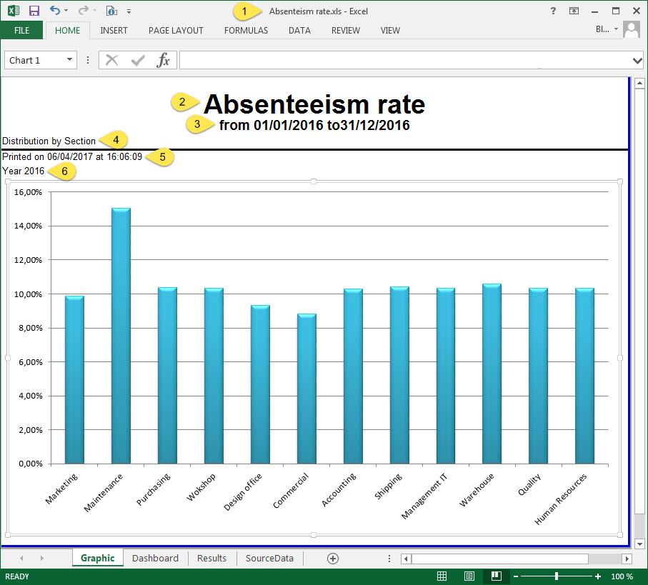
The report opens in Excel® format and can then be adapted to your requirements.
The shades of blue, the Arial text font (28 pt, bold, underlined and centered) and the type of graph (chart) are set by default.
The dashboard can be customised using the various tools available in Excel®: • change the character font and size, • change the colour fields (plain, graded, etc.) and the background, • display a secondary gridline, • change the text orientation, • add/delete data, • change the type of graph (bar graph, line graph, pie chart, etc.). Influence of the setup on the customisation
|


By clicking on the
|


The Results tab allows you to: •view the number of employees concerned by this report •view in detail the data that was not registered when the data was extracted
|
